


Understanding the Z-Pattern in Web Design
Have you ever noticed how your eyes move when you look at a website? It’s not random, like a bee buzzing around a flower! Our eyes actually follow special paths, and one of the most common is called the Z-Pattern. Think of it like drawing the letter “Z” on a page. You start at the top-left, move across to the top-right, then sweep diagonally down to the bottom-left, and finally go across to the bottom-right. This simple path helps designers make sure you see the most important stuff on a web page, especially on sites that don’t have tons of text. It’s a clever way to guide your attention and make your online journey a breeze!
Why Your Eyes Follow the Z
Why do our eyes naturally follow this Z-shape? Well, it mostly comes down to how many of us learn to read. In countries like the United States, we read from left to right and from top to bottom. So, when you land on a new web page, your eyes typically start their journey in the top-left corner. It’s the natural starting line for information! From there, your eyes quickly scan across the top of the page. Then, if there isn’t a lot of text, your eyes don’t just keep going left-to-right on new lines. Instead, they make a quick diagonal jump to look for the next important thing, usually further down and to the left. Finally, they settle at the bottom-right, often where a big button or a final piece of information waits. This pattern is powerful because it matches our natural habits, making websites feel easy and intuitive to use.
The Journey of Your Eyes: Breaking Down the Z-Pattern
Let’s really zoom in on how your eyes dance across a page following that Z-shape. Understanding each step can help you see why certain parts of a website are placed where they are. Think of it as a guided tour for your eyeballs!
1. The First Glance: Top-Left to Top-Right
When you first open a new website, where does your gaze go? Almost always, it’s straight to the top-left corner. This spot is super important! It’s usually where you’ll find the website’s logo. Why? Because the logo tells you immediately where you are and who you’re visiting. It’s like the name of a store above its door.
From the logo, your eyes smoothly travel across the top of the page to the top-right corner. This top line, often called the “header,” is prime real estate. Here, you’ll often find crucial things like:
- The main menu, so you can jump to different parts of the site.
- A search bar, if you’re looking for something specific.
- Sometimes, a link to your shopping cart or your account if you’re a returning customer.
- Or even a special offer or a link to a rewards program, like the fantastic loyalty programs that help stores keep their best customers happy.
This first horizontal line of the “Z” establishes the identity of the site and offers key navigation points.
2. The Diagonal Dive: Top-Right to Bottom-Left
After your eyes sweep across the top, they don’t just stay there. Instead, they make a quick, energetic dive diagonally down the page. This is the main “diagonal” part of the Z. What usually catches your eye here? Often, it’s the biggest, most exciting part of the page:
- A beautiful, eye-catching image or a video.
- A bold headline that grabs your attention.
- A powerful message that tells you what the website is all about or what special deal they have.
This diagonal path is designed to lead your eye from the initial header information to the central, most compelling content on the page. It’s where the website tries to tell you its main story or show off its star product.
3. The Final Stop: Bottom-Left to Bottom-Right
Once your eyes have followed that diagonal path and soaked in the main message or image, they land around the bottom-left of the page. From there, they move across to the bottom-right corner. This last horizontal line of the “Z” is where the website usually wants you to take action. It’s the grand finale!
What kind of actions are we talking about?
- A big, bright button that says “Shop Now” or “Learn More.”
- A form to sign up for a newsletter.
- Important bits of information that convince you to move forward, like glowing customer reviews or a quick summary of benefits.
- Sometimes, even more navigation links or social media icons.
This final part of the Z is all about guiding you to the next step, making it super clear what the website wants you to do after you’ve seen their main pitch.
So, the Z-Pattern isn’t just a random shape; it’s a carefully planned path that helps websites tell their story and encourage visitors to engage. It’s all about making your online experience as clear and simple as possible.
Where the Z-Pattern Shines Brightest
While the Z-Pattern is a handy tool for many kinds of websites, it really excels in certain situations. It’s not a one-size-fits-all solution, but when used correctly, it can make a big difference in how easily people understand and interact with your site. Think of it as a spotlight for your most important content!
Simple, Content-Light Pages
Imagine a page that doesn’t have paragraphs and paragraphs of text. Maybe it’s a page showing off a new product with a big picture, a short description, and a button to buy. Or perhaps it’s a page that introduces a company with a catchy slogan and a “Contact Us” button. For these types of pages, where visuals and quick messages are key, the Z-Pattern is perfect. It helps your eyes glide through the main points without getting lost in too much reading.
Landing Pages
Have you ever clicked on an ad and landed on a special page designed just for that ad? That’s usually a “landing page.” These pages have one main goal: to get you to do one specific thing, like sign up for something, download an e-book, or buy a product. The Z-Pattern helps designers create a clear path straight to that goal. Your eyes see the main message, the compelling image, and then are smoothly guided to the “Sign Up” or “Buy Now” button. Tools like optimizing for conversion rates are often employed on such pages, and the Z-pattern is a great aid.
Product Pages
When you’re shopping online, a product page needs to give you all the key info quickly. The Z-Pattern can help here too. You might see the product name and brand (top-left), a beautiful photo of the item (sweeping diagonally), and then a summary of features, customer reviews, and the “Add to Cart” button (bottom-right). This layout makes it easy to quickly grasp what the product is about and decide if you want to buy it. High-quality ecommerce product reviews placed strategically can significantly influence this decision.
Homepages
The homepage of a website is like the front door of a store. It needs to welcome you, tell you what the store sells, and show you where to go. Many homepages use a Z-Pattern to present their brand, their main offerings, and a clear path to explore further. For example, a website might highlight their loyalty program at the top-right, a main banner with a seasonal sale in the middle, and then showcase popular products or a “Shop All” button at the bottom-right.
In summary, the Z-Pattern is a fantastic choice for pages where you want to quickly communicate key information and encourage a specific action, without overwhelming the visitor with too much text. It’s about efficiency and impact!
Designing with the Z-Pattern in Mind: Practical Tips
Now that we know what the Z-Pattern is and where it works best, how can you actually use it to make a website super effective? It’s not about drawing a literal “Z” on the page, but rather arranging your content in a way that guides the eye along that familiar path. Here are some hands-on tips to make the Z-Pattern work for you:
Place Your Logo and Main Navigation Wisely
Remember that first part of the Z? The top-left corner is the undisputed home of your logo. It’s the brand identifier, telling visitors immediately who you are. Then, along the top-right, place your most important navigation links. Think about the few things every visitor will look for: “Shop,” “About Us,” “Contact,” or perhaps a link to your exciting loyalty program. This sets the stage for the user’s journey.
Hook Them with a Hero
The diagonal sweep of the Z is where you capture attention. This is the perfect spot for your “hero section.” What’s a hero section? It’s often a large, eye-catching image or video, paired with a compelling headline. This visual and textual hook should be powerful enough to make people want to continue down the Z-path. It could be showcasing your latest product, a special offer, or a strong brand message. The goal is to draw the eye from the top-right down towards the bottom-left with something impactful.
Call to Action (CTA) Power
The final stop on the Z-Pattern, the bottom-right corner, is gold for your main Call to Action (CTA). This is where you want to tell your visitors exactly what you want them to do next. Make your CTA button big, bright, and impossible to miss. Phrases like “Shop Now,” “Get Started,” “Sign Up,” or “Join Our Loyalty Program” work wonderfully. This is the culmination of the journey, where viewing turns into action.
Integrate Important Information Naturally
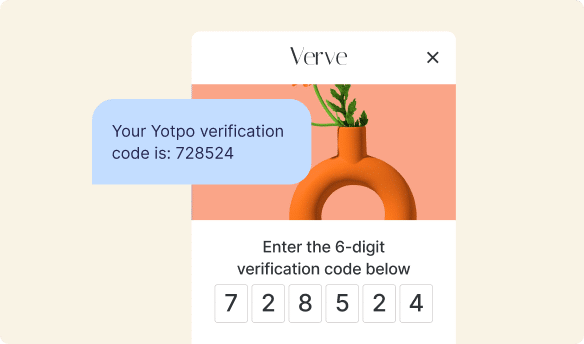
Beyond the main elements, you can strategically place other key information along the Z-path to support your main message. For example, if you want to build trust, you could place a snippet of glowing customer reviews near your product image (along the diagonal) or right before your main CTA. Showing off your happy customers through user-generated content at these key points can really help persuade visitors to take the plunge. Yotpo’s tools for reviews can make this super easy to integrate seamlessly into your design.
By thoughtfully arranging these elements, you’re not just putting things on a page; you’re crafting a clear, natural pathway for your visitors’ eyes, making their experience smooth and effective.
Example Elements for Your Z-Pattern Design
Let’s look at some common elements and where they might fit into a Z-Pattern layout to guide your visitors:
- Logo: Top-left corner (always!).
- Main Menu Items: Stretched across the top-right, or clustered in the top-right (e.g., “Shop,” “About,” “Rewards” – the latter powered by Yotpo Loyalty).
- Hero Image/Video: Dominating the central area, from the top-right leading down diagonally. This is your main visual message.
- Headline/Sub-headline: Placed over the hero image or just below it, clearly communicating your main offer or value proposition.
- Key Product Features or Benefits: Often placed along the diagonal path, breaking up the visual with short, punchy points.
- Social Proof (Customer Reviews/Ratings): Strategically placed below the main product/offer, perhaps near the bottom-left, to build trust before the final CTA. Think about how easily Yotpo Reviews can display these.
- Main Call to Action (CTA): Bottom-right corner. This is your “Buy Now,” “Sign Up,” or “Learn More” button.
Thinking about these elements like pieces on a board game helps you arrange them for maximum impact within the Z-Pattern.
Understanding User Behavior: Why Design Patterns Matter for Your Business
You might be wondering, “Why bother with all these patterns like the Z-Pattern?” The answer is simple yet powerful: it’s all about making your website easy and enjoyable for people to use. When a website is well-designed, it feels natural, almost like the site knows what you’re thinking. This isn’t magic; it’s smart design that understands how people behave online.
How Good Design Improves User Experience
Think about walking into a store. If the aisles are messy, products are hard to find, and no one helps you, you’re probably not going to stay long, right? The same goes for websites. A good design, using patterns like the Z-Pattern, creates a smooth “user experience” (UX). It means:
- Less Thinking: Visitors don’t have to guess where to look or what to do next. The path is clear.
- More Enjoyment: When things are easy, people enjoy being on your site more.
- Feeling Understood: A well-designed site makes visitors feel like their needs are being met effortlessly.
How Better UX Leads to More Engagement and Sales
When visitors have a great experience, good things happen for your business:
- More Time on Site: People stick around longer to explore.
- Higher Engagement: They click more, read more, and interact more.
- Increased Sales: This is the big one! If people can easily find products, read compelling information, and see a clear “buy” button, they’re much more likely to make a purchase. This directly impacts your ecommerce conversion rate – how many visitors turn into customers.
The Role of Clear Pathways in Decision-Making
Every time someone visits your site, they’re making decisions: “Do I trust this site?” “Is this product right for me?” “Should I buy it now?” Good design patterns, like the Z-Pattern, create clear pathways that guide visitors through these decisions. They highlight the information needed to build trust, showcase product benefits, and ultimately, lead them to that final “yes.” Understanding the consumer decision-making process is crucial, and design patterns are a powerful tool to influence it positively.
Boosting Engagement and Trust with Smart Design
This is where tools like Yotpo’s Reviews and Loyalty programs really shine, especially when combined with smart design patterns:
- Visible Product Reviews: Imagine a Z-Pattern layout where, just before the “Add to Cart” button, you see star ratings and glowing testimonials powered by Yotpo Reviews. This user-generated content acts as a powerful trust signal, guiding the user’s eye and encouraging them to take the next step. It’s like having a friend tell you how great a product is right at the moment you’re about to buy.
- Easy-to-Find Loyalty Programs: If your loyalty program is hidden, people won’t join it. But if a “Join Rewards” link is prominently placed in the top-right corner of your Z-Pattern, or if loyalty benefits are mentioned along the diagonal, it makes signing up feel natural and rewarding. Yotpo Loyalty helps you create and manage these programs, and the Z-Pattern helps you show them off effectively.
By intentionally designing with user behavior in mind, you’re not just making a pretty website; you’re building a more effective one that helps your business grow by making customers happy and confident in their choices.
Z-Pattern vs. F-Pattern: Which One Should You Use?
You might have heard about another popular design pattern called the F-Pattern. While the Z-Pattern is great for visuals and quick actions, the F-Pattern works differently and is better for other kinds of content. It’s important to know the difference so you can pick the best pattern for your page!
What is the F-Pattern?
Imagine reading a newspaper or a very long article online. Your eyes usually do this:
- They scan across the top (like the first bar of the “F”).
- Then they drop down a bit and scan across a shorter line (the second bar of the “F”).
- Finally, they scan down the left side of the page looking for keywords or interesting headlines (the vertical stem of the “F”).
The F-Pattern is all about scanning text. People using this pattern are usually looking for specific information, not just admiring visuals. They want to get the gist of an article quickly.
When to Use Z-Pattern vs. F-Pattern
The key difference is the kind of content you have and what you want your visitors to do:
- Use the Z-Pattern when:
- Your page has strong visuals and less text.
- You want to guide visitors to a specific action, like buying something or signing up.
- You have a clear main message that you want to highlight.
- Examples: Landing pages, homepages, product pages.
- Use the F-Pattern when:
- Your page is heavy on text, like a blog post, a news article, or search results.
- Visitors are likely to be scanning for information rather than looking for a clear CTA.
- You want to make sure the beginning of each paragraph or section is seen.
- Examples: Blog posts, “About Us” pages with lots of text, search engine results pages.
It’s also important to remember that these patterns aren’t always used strictly on their own. Sometimes, a page might blend elements of both! For instance, a homepage might use a Z-Pattern for its main visual banner and CTA, but then use F-Pattern principles for a section displaying recent blog articles below. The goal is always to make the content as easy to understand and interact with as possible.
A Quick Comparison Table
Let’s put the two side-by-side to make it even clearer:
| Feature | Z-Pattern | F-Pattern |
|---|---|---|
| Best For | Pages with fewer words, strong visuals, and a clear call to action (like landing pages, homepages, individual product pages). | Pages with lots of text, like articles, blog posts, or search results. Visitors are looking for specific info. |
| Eye Movement | Your eyes move in a “Z” shape: top-left, top-right, down diagonally to bottom-left, then across to bottom-right. | Your eyes move in an “F” shape: across the top, then a shorter scan across, then down the left side. |
| Key Placement | Important elements are at the “corners” of the Z. | Important elements are usually along the left edge and at the very top of the page. |
| Main Goal | To guide the user to a specific action (e.g., “Buy Now,” “Sign Up”). | To allow users to quickly scan and find information. |
By choosing the right pattern for the right kind of page, you can create a much more effective and user-friendly website. It’s all about matching the design to how your visitors naturally look at and process information.
Common Mistakes to Avoid When Using the Z-Pattern
The Z-Pattern is a wonderful tool, but like any tool, it can be used incorrectly. Avoiding these common mistakes will help you make sure your Z-Pattern design is as effective as possible and truly helps your visitors, rather than confusing them.
Over-Cluttering the Z-Path
One of the biggest no-nos is stuffing too much information or too many distracting elements into the Z-path. Remember, the Z-Pattern works best when the page is clean and focused. If you put too many pictures, too much text, or too many buttons along the Z, your visitors’ eyes won’t know where to go. They’ll get overwhelmed and might just leave. Keep it simple and highlight only the most important things at each point of the Z.
Making the Diagonal Too Long or Confusing
The diagonal sweep of the Z is meant to be a smooth, quick journey from the top-right to the bottom-left. If this diagonal path is too long, or if there’s nothing interesting to look at during the sweep, users might lose interest. Also, avoid putting vital information only in the very middle of this diagonal if it doesn’t clearly connect the top and bottom corners. It needs to feel like a natural flow, not a random jump.
Ignoring Mobile Responsiveness
Most people browse websites on their phones these days. A design that looks great on a big computer screen might look totally different and confusing on a small phone screen. The Z-Pattern needs to be “responsive,” meaning it adjusts and still makes sense no matter the screen size. What was a clear Z on a desktop might turn into a top-to-bottom scroll on mobile, and your content needs to be arranged so it still guides the eye effectively in that linear fashion. Always test your designs on different devices!
Not Testing Your Designs
Perhaps the most important mistake to avoid is assuming your design works perfectly without actually checking. What you think is clear might be confusing to others. Always test your Z-Pattern layouts with real people. Watch where their eyes go, ask them what they notice first, and see if they can easily find the main call to action. Testing helps you refine your design and make sure it’s truly effective for your audience. Learning about conversion rate optimization techniques can give you insights into how to test and improve.
By being mindful of these pitfalls, you can ensure your Z-Pattern design genuinely serves its purpose: to create an intuitive and effective experience for every visitor.
Putting It All Together: The Z-Pattern and Your Online Store
Let’s imagine you’re visiting your favorite online store, maybe one that sells cool sneakers or awesome gadgets. How might the Z-Pattern guide your journey and help you decide what to buy? It’s like a silent helper, making your shopping trip easier and more fun!
Picture this:
- You land on the homepage. First, your eyes naturally zoom to the top-left corner. What do you see? The store’s shiny logo! You instantly know where you are.
- Your eyes then quickly glide across the top to the top-right corner. There, you spot handy links: “New Arrivals,” “Sale,” and perhaps even a prominent “Rewards” link. If the store uses Yotpo Loyalty, this is your easy gateway to earning points and getting special discounts. You might even click on it later!
- Now, your eyes sweep diagonally down the page. This is where the store shows off its main attraction. Maybe it’s a huge, vibrant picture of their newest sneaker collection, with a catchy headline like “Step Up Your Style!” or “Limited Edition Drop!” This visual hook grabs your attention and tells you what’s exciting right now.
- Finally, your eyes land at the bottom-right corner. What’s waiting for you there? Often, it’s a bold “Shop Now” button, inviting you to explore the highlighted products. And just above or beside it, you might see a snippet of glowing customer reviews, like “Amazing comfort, 5 stars!” These reviews, perhaps powered by Yotpo, build trust and give you confidence before you click that button.
This entire journey, following the invisible Z, helps the store quickly communicate its brand, showcase its products, build trust with reviews, and encourage you to take the next step, like making a purchase or joining their loyalty program.
How Yotpo Helps Enhance the Z-Pattern Experience
Yotpo offers powerful tools that fit perfectly into a Z-Pattern design, making your online store more effective and trustworthy:
- Reviews: Imagine placing those compelling customer reviews strategically along your Z-Pattern. For example, if your hero section displays a product, showing its star rating or a short testimonial from Yotpo Reviews near the product image can quickly build trust. Or, placing a collection of your best reviews close to the final “Add to Cart” button in the bottom-right corner. This helps potential customers quickly grasp the value and social proof, making them more likely to convert.
- Loyalty: With Yotpo Loyalty, you can create fantastic rewards programs. The Z-Pattern helps you show these off! A “Join Our Rewards” link placed clearly in the top-right navigation helps new visitors immediately see the benefits of becoming a loyal customer. Or, perhaps a small banner along the diagonal sweep explains how many points they can earn on a purchase, making the offer irresistible. This makes it super easy for customers to find and engage with your loyalty program, encouraging repeat purchases.
- Synergy for Engagement: While Reviews and Loyalty are distinct, they work together beautifully. Happy customers who leave product reviews are often your most loyal customers. And members of your loyalty program are more likely to share their experiences and leave reviews. Both create valuable user-generated content (UGC) that can be integrated into your Z-Pattern layouts, strengthening trust and encouraging further engagement along every step of the customer journey.
By using the Z-Pattern to thoughtfully arrange elements like Yotpo Reviews and Loyalty program links, you’re not just designing a page; you’re crafting an engaging, trustworthy, and effective path for every visitor to your online store.
Final Thoughts on the Z-Pattern for a Great User Experience
So, we’ve explored the amazing Z-Pattern, a simple yet powerful way to design websites that feel natural and easy to use. Remember, it’s not just a fancy drawing; it’s a smart strategy that taps into how our eyes naturally scan information, especially on pages that rely more on visuals and clear calls to action rather than dense blocks of text.
Using the Z-Pattern helps you:
- Guide attention: You control where people look first, second, and last.
- Communicate quickly: You can deliver your most important messages fast.
- Encourage action: You lead visitors smoothly to what you want them to do, whether it’s buying a product, signing up for a newsletter, or joining a loyalty program.
- Build trust: By strategically placing elements like compelling customer reviews, you can reassure visitors at key decision points.
Ultimately, the Z-Pattern is a fantastic tool in the world of web design, helping create a more delightful and efficient experience for everyone who visits an online store. It’s about designing with the user in mind, making their journey intuitive and enjoyable, and in turn, helping businesses thrive. Just remember that design is a continuous journey – always keep an eye on how your visitors interact with your site, and don’t be afraid to test and refine to make it even better!


 Join a free demo, personalized to fit your needs