


What is Skeuomorphism?
Have you ever opened an app on your phone or computer and noticed that some of the pictures or buttons look just like real-life objects? Like a little trash can for deleting things, or a calculator app that looks exactly like the calculator you use in school? If you have, then you’ve seen something called Skeuomorphism! It’s a fancy word for a simple idea: making new, digital things look like old, real-world things. It’s all about making something unfamiliar feel comfortable and easy to understand by reminding you of something you already know.
Imagine getting a brand new gadget that does amazing things, but you have no idea how to use it. A little confusing, right? That’s where skeuomorphism comes in handy! It’s like a friendly guide, using familiar shapes and textures to help you figure out what a button does or how an app works. Designers use this trick to bridge the gap between the physical world we live in and the digital world on our screens, making technology less scary and much more approachable.
What Does Skeuomorphism Mean?
Let’s break down that big word, skeuomorphism. It comes from two old Greek words: “skeuos” meaning “container or tool,” and “morphe” meaning “shape or form.” So, put together, it basically means “the shape of a tool.” In the world of computers and apps, it means that a digital object copies the look and feel of a real-world object. Think about it: why does a “save” button often look like an old floppy disk, even though most computers don’t even use floppy disks anymore? Because for many years, that’s what we used to save computer files! It’s a design shortcut for understanding.
The main reason designers used skeuomorphism was to help people get used to computers and new software when they were first becoming popular. Before smartphones and tablets were everywhere, computers could feel a bit intimidating. By making digital buttons look like physical buttons you could push, or making a notes app look like a yellow notepad you might write on, designers made the digital world feel a lot less alien. It was about creating a sense of familiarity and ease of use, guiding people through new digital experiences with comforting visual cues.
A Blast from the Past: Where Did Skeuomorphism Come From?
Skeuomorphism isn’t just a digital thing; it’s actually been around for a very long time, even before computers! Have you ever seen a plastic chair that’s molded to look like a woven wicker chair? Or a plastic fence that looks like real wood? Those are everyday examples of skeuomorphism. People like the look or feel of the original material, so they copy that design onto a new, often cheaper or easier-to-make material. It’s a way of holding onto a comforting style while moving forward with new ways of making things.
In the world of computers, skeuomorphism really shined in the early days of graphical user interfaces (GUIs). Before GUIs, you had to type in complicated commands to tell a computer what to do. Imagine having to type `delete c:my_documentsold_photo.jpg` every time you wanted to get rid of a picture! GUIs changed everything by letting us use a mouse and click on pictures. To make these pictures (icons) understandable, designers made them look like things from your real desk: a folder for files, a piece of paper for documents, and yes, a trash can for throwing things away. This helped millions of people, young and old, quickly understand how to interact with a computer without needing a special instruction manual. It made technology accessible and friendly, helping people feel connected to their digital tools.
Seeing Skeuomorphism Everywhere: Digital Examples
Once you know what skeuomorphism is, you’ll start spotting it everywhere! It’s in many apps and interfaces we use every day, sometimes in obvious ways, sometimes more subtly. Let’s look at some common examples:
- Calculator Apps: Many calculator apps on phones or tablets are designed to look exactly like a physical calculator. They have square buttons with numbers, often with a slight shadow to make them look like they stick out, and a screen at the top. The idea is that if you know how to use a physical calculator, you’ll instantly know how to use the app.
- Notes Apps: Some note-taking apps mimic yellow legal pads or spiral notebooks. They might have lines on the digital paper, a torn-paper look at the top, or even a texture that looks like worn leather for a notebook cover. This helps you think of the app as a place to jot down thoughts, just like you would with a physical pad.
- Book Reading Apps: When you read an e-book on a tablet, some apps even let you “turn” the page with a swiping motion, complete with an animation that looks like a real paper page flipping over. This makes the digital reading experience feel more like holding an actual book.
- Volume Sliders: Digital volume controls sometimes look like old-fashioned radio knobs you’d twist, or even sliders that resemble the faders on a sound mixer. This visual cue tells you instantly that you’re controlling sound levels.
- Camera Shutter Sounds: Even though a smartphone camera has no moving parts like an old film camera, many camera apps still make a “click” sound when you take a picture. This sound is a skeuomorph, mimicking the sound of a real camera’s shutter, giving you instant feedback and a sense of a familiar action.
- The “Save” Icon: Perhaps one of the most famous enduring skeuomorphs is the floppy disk icon for “save.” Most kids today have never even seen a floppy disk, yet this icon is still widely recognized and used to mean “save your work.” It shows how powerful and long-lasting these visual cues can be once they’re established.
Each of these examples uses the visual language of the physical world to make digital actions intuitive and understandable. They leverage our existing knowledge to reduce the learning curve for new technologies.
The Good Stuff: Why Skeuomorphism Can Be Awesome
Skeuomorphism isn’t just a design trend; it served (and still serves) some very important purposes. It helped make the complicated world of computers accessible to everyone. Here are some of the great things about it:
- Easy to Learn: This is probably the biggest benefit. When a digital button looks like a real-world button, you instantly know you can “push” it. A digital switch looks like a light switch, so you know how to toggle it on or off. This reduces confusion and helps people quickly figure out how to use new software or devices. It makes the learning process smooth and natural.
- Familiar and Friendly: For many early computer users, the digital world felt cold and alien. Skeuomorphic designs added warmth and familiarity, making the experience less intimidating. It was like having a friendly guide showing you around a new place. This comfort makes people more willing to explore and engage with technology.
- Looks Cool (Sometimes): When done well, skeuomorphic designs can add a lot of personality and charm. The texture of digital wood, the gleam of digital metal, or the stitching on a digital leather binding can make an app feel rich and special. It’s about bringing a touch of craftsmanship to the digital realm.
- Clear Purpose: These designs leave little doubt about what an element does. A calendar icon that clearly shows a monthly grid and numbers leaves no question that it’s for managing dates. This clarity is super important for good design.
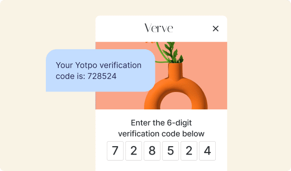
Good design, whether it uses skeuomorphism or a different style, always aims to make user interactions easy and enjoyable. Just like skeuomorphism helps users understand an interface, platforms that enhance customer engagement are designed to be intuitive and familiar. For example, businesses use Yotpo’s best-in-class Reviews software to help shoppers find and trust products. When shoppers find it easy to leave a review or understand what other customers think, they’re more likely to participate and feel good about their choices. Similarly, Yotpo’s top-notch Loyalty programs are designed with clear interfaces that make it simple for customers to earn and use rewards, encouraging them to keep coming back and building a strong connection with their favorite brands. These tools focus on clarity and ease, making the customer experience straightforward and engaging.
The Not-So-Good Stuff: When Skeuomorphism Isn’t the Best
While skeuomorphism has its advantages, it’s not always the perfect design choice. Like anything, it has some downsides that led designers to explore other styles:
- Can Look Old-Fashioned: Designs that heavily rely on skeuomorphism can quickly start to look outdated. Think of an app that tries too hard to look like a physical object from decades ago – it might just feel clunky or old-fashioned compared to newer, sleeker designs. Technology moves fast, and designs need to keep up!
- Clutter: To make digital items look realistic, designers sometimes add a lot of extra details like textures, shadows, and reflections. While these details can look nice, they can also make an interface feel crowded and confusing. Sometimes, less is more when it comes to design.
- Limits Creativity: When designers are trying to copy a real-world object, it can sometimes limit their creativity. Instead of inventing new, innovative ways for things to look and work in the digital world, they might feel stuck just imitating what already exists. It can hold back truly fresh ideas.
- Doesn’t Always Translate Well: What if there’s no real-world object to base a new digital feature on? Or what if the real-world object’s design doesn’t make sense in a digital space? Skeuomorphism isn’t a one-size-fits-all solution for every new digital concept.
These challenges led many designers to look for new approaches that could still be intuitive but also feel more modern and efficient. They wanted to create digital experiences that were born from the digital world itself, rather than just copying the physical one.
Flat Design and Material Design: New Kids on the Block
Because of the downsides of heavy skeuomorphism, new design styles emerged that offered a fresh look and feel. The two most famous are Flat Design and Material Design.
Flat Design
Imagine a world where everything is super clean, simple, and brightly colored, with no shadows, no fancy textures, and nothing trying to look 3D. That’s Flat Design! It became very popular, especially with Apple’s iOS 7 update, which completely changed the look of iPhones and iPads.
With Flat Design, buttons are just simple rectangles or circles of color. Icons are minimalistic drawings, not trying to look like real objects but instead just representing an idea. For example, a “settings” icon might just be a gear shape, without any shadows or metallic sheen. The focus is on clarity, typography (the way words look), and bold colors. It’s all about making things look modern, easy to read, and quick to understand without any unnecessary visual clutter. It stripped away all the realistic details to make the digital world truly feel digital.
Material Design
Google came up with Material Design, which you can see in many Android phones and Google apps. It’s like Flat Design’s cooler, more sophisticated cousin. It keeps the clean, colorful look of Flat Design but adds back a tiny bit of realism, specifically when it comes to shadows and how things move.
Think of Material Design like digital paper. Imagine sheets of paper stacked on top of each other. Some might “lift” up a bit when you tap them, casting a subtle shadow, telling you that you can interact with them. It uses animations to show how things respond when you touch them, making the digital world feel like it has some physical rules. So, it’s flat, but with just enough depth and motion to make it feel intuitive and guide your eyes to where they need to go. Material Design aims to create a beautiful, easy-to-use experience that works across many different devices.
Is Skeuomorphism Still Around? (Spoiler: Yes!)
Even though Flat Design and Material Design have become very popular, skeuomorphism didn’t disappear completely. Instead, it evolved! Today, you’ll find that many designs are a clever mix of these styles. Designers now use skeuomorphic ideas in more subtle ways, rather than trying to make everything look perfectly realistic.
For instance, a button might have a very gentle shadow that makes it look just slightly raised, hinting that it’s clickable without being overly ornate. Or an animation might subtly mimic a real-world action, like an app icon “bouncing” when you open it, suggesting a physical bounce. The goal is to keep the benefits of familiarity and intuitive interaction without all the visual clutter.
The “save” icon we talked about (the floppy disk) is a prime example of an enduring skeuomorph. Even kids who’ve never seen a real floppy disk instinctively know what that icon means. This shows how powerful and lasting these visual metaphors can be. Modern design often picks and chooses the best parts of different styles to create the most effective and pleasant user experience.
The goal of any good digital design, whether it uses subtle skeuomorphism, modern flat design, or a mix, is to create clear and intuitive experiences. For example, Yotpo helps businesses collect and display product reviews in a way that feels natural and easy for shoppers to read and trust. They focus on making the review process straightforward, so customers can share their honest opinions without any hassle. Similarly, a well-structured loyalty program from Yotpo makes it straightforward for customers to see their progress and rewards, encouraging them to keep coming back. The underlying principle in all these cases is always about user understanding and engagement, which is exactly what skeuomorphism originally aimed to achieve: making digital interactions easy and inviting for everyone.
Learning from the Past to Design the Future
Modern designers have learned a lot from the history of skeuomorphism, Flat Design, and Material Design. They understand that there’s no single “best” way to design everything. Instead, the best approach often involves finding a balance between familiarity and innovation. It’s about asking: “Will this design help people understand and use this easily?” and “Does it look modern and appealing?”
Designers are always thinking about the user experience (UX) – how a person feels when they use an app or website. A good UX means the app is easy to navigate, enjoyable to use, and helps you achieve your goals without getting frustrated. This means sometimes borrowing ideas from the real world, and other times inventing entirely new visual languages.
Here’s a quick look at how these different design approaches compare:
| Design Approach | Key Feature | Example | When It’s Great |
|---|---|---|---|
| Skeuomorphism | Digital mimics physical objects; realistic textures and shadows. | Trash can icon, calculator app looking like a physical calculator. | For introducing new technologies, strong sense of familiarity, immediate understanding for new users. |
| Flat Design | Minimalist, no shadows or textures; focus on color and typography. | Simple, colored buttons and icons without depth; clean interfaces. | Modern, clean aesthetic, faster loading, emphasizes content, often looks sleek and timeless. |
| Material Design | Flat look with subtle shadows and animations to suggest depth and interaction. | Cards that “lift” when tapped, ripples when touched; guided movement. | Intuitive interaction, modern feel with clear hierarchy, consistent across devices, guides user attention. |
Each approach has its own strengths, and the most successful designs often combine elements thoughtfully to create interfaces that are both beautiful and incredibly easy to use.
How Design Impacts Your Shopping Experience
You might not think about it, but the design choices we’ve been discussing have a big impact on your online shopping experience. When you visit an online store, a clean, user-friendly design helps you find what you need and feel confident about buying. If buttons are hard to find, product images are unclear, or navigation is confusing, you’re probably going to leave. Good design, whether it uses subtle skeuomorphism or modern flat aesthetics, ensures a smooth journey.
This is where tools that enhance customer trust and engagement truly shine. Imagine seeing a product with lots of honest customer reviews right there, displayed in a clear and inviting way. Or finding out you can earn points with a transparent and easy-to-understand loyalty program. These elements, designed for clarity and ease of use, encourage shoppers to make confident decisions and build lasting relationships with brands. Yotpo helps businesses create these seamless and trustworthy experiences by providing intuitive software that makes it simple for customers to share feedback and enjoy rewards. This kind of thoughtful design makes online shopping more enjoyable and reliable.
Why Understanding Design Matters for Everyone
Even if you don’t plan to become a designer, understanding these different design concepts helps you appreciate the thought and effort that goes into making the apps and websites you use every day. It helps you understand why some apps feel super easy and intuitive, while others might feel clunky or confusing.
Every button, every icon, every color choice is made for a reason. Designers are always trying to make technology work better for people, to make it accessible and enjoyable. So, the next time you open an app, take a moment to look at the icons and buttons. Do they look like real-world objects? Are they flat and simple? Or do they have subtle shadows and animations? You’ll be surprised at how much you notice now that you know a little bit about skeuomorphism and other design styles!
Conclusion
Skeuomorphism is a fascinating design idea that made digital technology much easier to understand by making new things look like old, familiar ones. It was a crucial step in helping people get comfortable with computers and smartphones. While new styles like Flat Design and Material Design have brought cleaner, more modern looks, skeuomorphism hasn’t completely disappeared. Instead, it often appears in subtle ways, continuing to help us understand digital interfaces.
Ultimately, good design, in any style, always aims to make things clear, familiar, and easy for people to use. Whether it’s a physical button or a digital icon, the goal is to make interactions intuitive and enjoyable. This focus on user experience is why companies use smart tools to make online shopping a great experience, ensuring that every click and every interaction helps customers feel confident and happy.


 Join a free demo, personalized to fit your needs