


What is an Accessible Email, Anyway?
Have you ever tried to read something online, or maybe an email from your favorite store, and it just didn’t quite make sense? Maybe the words were too small, the colors were hard to see, or there were pictures without any explanation. It can be super frustrating, right?
Well, an accessible email is like a friendly message that’s designed so that everyone can easily read, understand, and use it. Think of it like a playground built for all kids, no matter if they use a wheelchair, wear glasses, or need a little extra time to figure things out. An accessible email makes sure no one is left out when it comes to getting important information or fun updates.
It’s about making sure your emails work well for people who might see things differently, hear things differently, or even use a computer in a special way. This means carefully choosing colors, words, and how the email is put together, so it’s a breeze for every single person to enjoy and interact with.
Why Should We Care About Accessible Emails?
You might be wondering, “Why is this such a big deal?” It’s a great question! Caring about accessible emails is important for a bunch of reasons, and they all boil down to being fair and smart.
First off, it’s simply the right thing to do. We live in a world where everyone deserves to get information and participate fully. Just like we make sure buildings have ramps for wheelchairs, we should make sure our digital messages, like emails, are easy for everyone to “walk” through. It shows respect and kindness to all customers and readers.
Second, it’s good for businesses. Imagine a company sends out an exciting email about a new toy or a special sale. If someone can’t read that email because the font is too small or the colors clash, they might miss out. And if they miss out, the business misses out on a potential customer! When emails are accessible, more people can understand what’s being offered, which can mean more happy customers and a stronger connection with a brand. This also means more people can engage with things like sharing their opinions through product reviews or joining a customer loyalty program.
Lastly, accessible emails often mean better emails for everyone. When you design an email to be clear and easy for someone with a specific need, you often make it better for everyone else too. Think about it: clear language, good contrast, and organized information are helpful whether you have a vision impairment or are just quickly checking your email on a tiny phone screen while waiting for the bus. It’s a win-win!
Who Benefits from Accessible Emails?
When we talk about email accessibility, we’re talking about making emails work for a whole bunch of different people. It’s not just one group; it’s many! Let’s explore who gets a big boost from accessible emails:
People with Visual Impairments
This includes people who are blind, have low vision, or are colorblind. For someone who is blind, they often use special software called a screen reader. This amazing tool reads out loud everything on the screen, including emails. If an email isn’t built correctly, the screen reader might get confused and not be able to tell the person what’s in the email. For people with low vision, big, clear text and strong color contrast are super important so they can actually see the words and pictures without squinting or straining their eyes. And for those who are colorblind, certain color combinations can make text completely disappear, so careful color choices are key!
People with Cognitive Disabilities
This group includes people who might have difficulties with reading, understanding complex information, or focusing for long periods. For them, emails that use simple language, short sentences, and are well-organized with clear headings are a huge help. It means they can get the main message quickly and easily, without feeling overwhelmed or confused by big words or tricky sentence structures. Avoiding jargon and breaking down information into small, manageable chunks makes a world of difference.
People with Motor Impairments
Some people might find it hard to use a mouse or a trackpad because they have difficulty with fine motor skills. They might use a keyboard, special switches, or even their voice to navigate websites and emails. For these individuals, an accessible email is one that can be easily navigated using only a keyboard. This means they can jump from one part of the email to another, click on links, and interact with any buttons without needing a mouse. If an email is designed only with mouse users in mind, it can be a frustrating experience.
Even People Without Disabilities!
Believe it or not, accessible emails help everyone! Have you ever tried to read an email on a tiny phone screen while outside in bright sunlight? Or maybe you’re in a hurry and just want to quickly scan for the important bits? Accessible design helps here too. Clear, concise writing, good contrast, and mobile-friendly layouts make emails easier for *everyone* to read, no matter their situation. Maybe your internet is slow, and images take forever to load – having good text descriptions means you still get the message. So, while we design for specific needs, the benefits spread far and wide, making a better experience for all readers.
Key Ingredients for a Super Accessible Email
Making an email accessible isn’t rocket science, but it does involve thinking a little differently about how we put our messages together. It’s all about being thoughtful and intentional. Here are some of the most important ingredients:
Clear and Simple Language
Imagine reading a long, confusing paragraph full of big, fancy words. Even if you understand them, it takes a lot of effort! For accessible emails, we want to keep the language as simple and direct as possible. Use short sentences, explain any tricky words, and get straight to the point. Think about explaining something to a friend – that’s the kind of friendly, easy-to-understand tone we’re aiming for. This helps everyone, especially those with cognitive disabilities or who are new to the language, grasp the message without a struggle.
Good Contrast and Big Text
Have you ever seen an email where light gray text is on a white background? It’s practically invisible! Good color contrast is crucial. This means making sure the color of your text stands out clearly against the color of your background. Dark text on a light background (like black on white) is usually best. Also, don’t be shy with text size! Small, tiny fonts are hard for everyone to read, especially on smaller screens or for people with low vision. Use readable font sizes that don’t make anyone squint. Often, larger default text sizes make a huge difference.
Images with Descriptions (Alt Text)
Pictures can make emails fun and engaging, but what if someone can’t see them? That’s where alt text (short for “alternative text”) comes in! Alt text is a brief description of an image that is hidden to most people but can be read aloud by screen readers. For example, if you have a picture of a happy dog fetching a ball, the alt text could be “A golden retriever happily fetches a red ball in a grassy park.” This way, someone who can’t see the image still understands what it’s showing. It’s like giving your pictures a voice!
Structured Like a Book (HTML Semantics)
Just like a good book has chapters and paragraphs, a good email needs a clear structure. This means using proper HTML tags that tell screen readers what each part of the email is. For example, using proper headings (like `
` and `
`) for titles and subtitles helps people quickly scan and understand the email’s layout. Using lists (`
` or `
`) for lists of items and tables (`
`) for presenting data also helps screen readers organize and explain the information clearly. It makes the email predictable and easy to navigate.
Links That Make Sense
When you click a link in an email, you expect to know where it’s taking you, right? Accessible links are clear and descriptive. Instead of just saying “Click Here,” try something like “Learn more about our new summer collection” or “Visit our loyalty program page.” This way, screen reader users know exactly where they’re going before they click, and it’s helpful for everyone because it gives more context. It also makes it easier to use with a keyboard, as you can quickly understand the purpose of each link.
Keyboard Friendly Navigation
Not everyone uses a mouse. Some people rely entirely on their keyboard to move around an email, tabbing from one link or button to the next. An accessible email makes sure that every interactive part (like buttons or links) can be reached and activated using just the keyboard. It also ensures that the “tab order” (the order in which you move through the email by pressing Tab) makes sense, going from top to bottom, left to right, just like you’d naturally read.
Responsive Design
You probably read emails on your phone, tablet, or computer – maybe even a smartwatch! Responsive design means your email looks good and is easy to use no matter what size screen it’s viewed on. Text doesn’t get cut off, pictures resize nicely, and buttons are still easy to tap. This is super important for accessibility because if an email is hard to read on a small screen, it creates a barrier for everyone, including those with vision impairments who rely on clear layouts.
How Businesses Use Emails (And Why Accessibility Matters There)
Emails are a powerful tool for businesses to talk to their customers. They use them for all sorts of important things, from telling you about a cool new product to thanking you for being a loyal shopper. And guess what? Accessibility is key to making sure these messages work for every single customer.
Emails for Getting Feedback (Reviews)
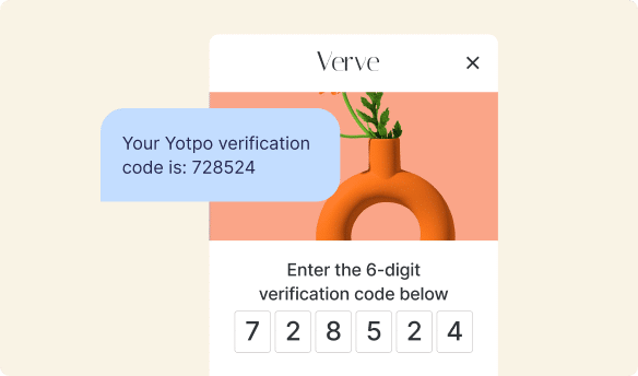
When you buy something awesome online, many businesses want to know what you think! They often send an email asking you to share your thoughts, which we call a review. Your reviews help other people decide if they want to buy that product too, and they help the business make their products even better. Imagine if that “Please Leave a Review” email was hard to read, or if the link to write your review was impossible to click for someone using a keyboard. It would be tough for you to give your feedback! Tools like Yotpo Reviews help businesses gather these important thoughts from customers, and making sure those request emails are accessible means everyone gets a fair chance to speak up and help others make smart buying choices. It helps ensure that all customers’ voices are heard, leading to a richer and more representative collection of ecommerce product reviews.
Emails for Loyalty Programs
Many businesses love to thank their best customers with special rewards. They do this through loyalty programs. These programs often send emails to tell you about how many points you’ve earned, what rewards you can get, or when there’s a special offer just for members. If an email about earning points or getting a discount isn’t easy to read because of bad colors or tiny text, you might miss out on a cool reward! Businesses using tools like Yotpo Loyalty want to make sure all their loyal customers, no matter their abilities, can easily understand and enjoy their benefits. Accessible emails for loyalty programs mean that every customer can engage with their rewards, stay updated, and feel truly appreciated. This helps create best loyalty programs that are inclusive and effective.
Other Important Emails
Besides reviews and loyalty, businesses send many other types of emails. Think about:
- Order Confirmations: When you buy something, you get an email saying your order went through. This is super important!
- Shipping Updates: Emails that tell you your package is on its way.
- Newsletters: Updates about new products, sales, or interesting articles.
- Customer Service: Responses to your questions or concerns.
For all these emails, accessibility is vital. If a shipping update is inaccessible, someone might not know when their package is arriving. If a customer service response is hard to read, they might feel ignored or misunderstood. By making all these crucial messages accessible, businesses ensure that every customer receives important information clearly and on time, building trust and a positive experience.
Tools and Tips to Make Emails Accessible
Making emails accessible might sound like a big job, but there are lots of helpful tools and simple tips that can make it much easier. You don’t have to be a computer wizard to make a big difference!
Use Email Testing Tools
Just like checking your homework for mistakes, there are special tools that can check your emails for accessibility issues. These tools can automatically look for things like low color contrast, missing alt text for images, or poorly structured HTML. They give you a report showing what needs fixing. Using these tools before sending an email is like having a helpful assistant make sure everything is perfect for everyone.
Simple Checklists
Sometimes, all you need is a good checklist! Here’s a basic one to get you started:
- Is the text large enough to read easily?
- Do the text and background colors have good contrast?
- Are all images described with alt text?
- Is the language clear, simple, and easy to understand?
- Are links descriptive (not just “Click Here”)?
- Can you navigate the entire email using only your keyboard (tabbing through links, etc.)?
- Does the email look good on a small phone screen?
- Are headings used correctly to organize the content?
Going through a checklist like this for every email helps you remember all the important steps and make sure you haven’t forgotten anything crucial.
Get Feedback
One of the best ways to know if your emails are truly accessible is to ask real people! If you can, ask someone who uses a screen reader, or someone who has low vision, to test your email. They can tell you firsthand what works well and what might be confusing. Their feedback is invaluable because they experience emails from a different perspective and can help you make improvements you might not have thought of on your own. It’s like having a friendly helper show you the way!
Real-World Impact: When Emails Are Accessible
So, what happens when businesses put in the effort to make their emails accessible? The impact is quite amazing! It creates a more inclusive and positive experience for everyone.
More People Engaging with Your Brand
When emails are easy to read and interact with, more people can connect with what a business is offering. This means more customers opening emails, clicking links, learning about new products, and participating in things like user-generated content or referral programs. If someone can easily understand an email about a special offer, they are much more likely to take advantage of it. It’s like inviting everyone to the party and making sure they all have a comfortable chair and can hear the music.
Better Understanding of Offers and Updates
Clear, accessible emails mean that every customer, regardless of their ability, can fully understand the message. This reduces confusion and misunderstandings. Customers know exactly what’s being offered in a sale, how to use their loyalty points, or what to expect from their recent order. This clarity builds trust and confidence in the brand. When customers feel understood and well-informed, they are more likely to become loyal customers and tell their friends about their great experience (which is a fantastic form of word-of-mouth marketing!).
Building Trust and Goodwill
When a business goes the extra mile to make its communications accessible, it shows that they care about all their customers. This thoughtfulness builds strong trust and goodwill. Customers appreciate being included and valued. This positive feeling can make them more likely to continue shopping with that business and recommend it to others. It’s a way for businesses to truly show their values and create a welcoming environment for everyone. This kind of customer experience can significantly improve a business’s ecommerce conversion rate and help with ecommerce retention.
The Future of Email and Inclusivity
The world of email and online communication is always changing, but one thing that will always be important is making sure everyone can participate. Accessible emails aren’t just a trend; they’re a fundamental part of good communication. As technology advances, we’ll likely see even more tools and techniques emerge to make emails even more inclusive.
The goal is to keep learning and keep trying to do better. By paying attention to details like clear language, good contrast, and proper structure, we can ensure that every email sent out into the world is a welcoming and understandable message for absolutely everyone. It’s about building a digital world where no one is left behind, and where every voice has the chance to be heard, whether they’re sharing a review or enjoying a loyalty reward.
Making emails accessible is an ongoing journey, but it’s one that leads to better connections, happier customers, and a more inclusive digital experience for us all.
- ` or `
- Order Confirmations: When you buy something, you get an email saying your order went through. This is super important!
- Shipping Updates: Emails that tell you your package is on its way.
- Newsletters: Updates about new products, sales, or interesting articles.
- Customer Service: Responses to your questions or concerns.
- Is the text large enough to read easily?
- Do the text and background colors have good contrast?
- Are all images described with alt text?
- Is the language clear, simple, and easy to understand?
- Are links descriptive (not just “Click Here”)?
- Can you navigate the entire email using only your keyboard (tabbing through links, etc.)?
- Does the email look good on a small phone screen?
- Are headings used correctly to organize the content?
- `) for lists of items and tables (`


 Join a free demo, personalized to fit your needs