


What is a Landing Page?
Imagine you’re going on a treasure hunt, and someone gives you a super clear map that leads straight to the treasure chest, without any detours or confusing paths. That’s a bit like what a landing page does for businesses and their customers online! A landing page is a special web page designed for just one thing: to get you to do a specific action. It’s not like a regular website page with lots of buttons and places to explore. Instead, it has a very focused message and a clear goal, like signing up for something, learning more, or buying a product. It helps guide visitors exactly where the business wants them to go, making it easier for everyone to find what they’re looking for.
What Makes a Landing Page Different from a Regular Website Page?
Think about a big store. A regular website page is like the entire store, with different departments for clothes, toys, food, and electronics. You can wander around, look at everything, and go wherever you want. There are many doors and signs pointing in different directions. But a landing page? That’s more like a special, tiny pop-up shop inside the mall that sells only one amazing new toy. When you walk into that pop-up shop, you know exactly why you’re there: to see or buy that specific toy. There aren’t many other things to distract you; it’s all about that one special item.
The main difference is focus. A regular website page, like a home page or an “about us” page, has many goals. It wants to introduce you to the company, show you different products, share news, and let you navigate freely. It has menus, links to other parts of the site, and lots of information. You can click around and explore. A landing page, on the other hand, is like a laser beam. It has one specific mission. Its job is to make you take a single action, like filling out a form, signing up for an event, or clicking a button to learn more about a special offer. There are usually fewer links to click away from the page, keeping your attention right where the business wants it.
Why this focus matters:
- Less Distraction: With fewer places to click, you’re more likely to focus on the main message.
- Clear Goal: It’s obvious what the page wants you to do, which helps you decide.
- Better Results: Businesses find that these focused pages often do a better job of getting people to complete the desired action.
So, while your favorite brand’s website might have hundreds of pages, a landing page is usually just one special page created for a particular reason, like a new product launch or a holiday sale. It’s a powerful tool because it cuts through the clutter and gets straight to the point.
Why Do Businesses Use Landing Pages?
Businesses use landing pages for lots of smart reasons, mainly to help them achieve specific goals. Think of it like this: if a business wants to collect phone numbers for a new customer drawing, they wouldn’t send people to their general “contact us” page. That page might have too much other stuff on it. Instead, they’d send them to a landing page designed just for that drawing. Here are some common reasons why businesses love using landing pages:
- To Get Specific Information: Many businesses want to know who is interested in their products or services. A landing page is perfect for collecting information like names, email addresses, or even zip codes. This helps them understand their potential customers better and send them useful updates later.
- To Promote Special Offers: Have you ever seen an ad for a “buy one get one free” deal or a limited-time discount? When you click that ad, it often takes you to a landing page. This page will explain the offer clearly and tell you exactly how to get it. It’s a direct route to the deal!
- To Sell a Single Product or Service: Sometimes, a business wants to really focus on selling just one item or promoting one service. A landing page allows them to highlight all the great things about that specific item without other products getting in the way.
- To Encourage Sign-Ups: If a business is launching a new online class, a newsletter, or an event, they’ll use a landing page to get people to sign up. The page will explain what the event or newsletter is about and make it super easy to join.
- To Help Customers Take Action: Overall, landing pages are about guiding customers to do something specific. This could be downloading an ebook, watching a video, requesting a demo, or simply learning more about a particular topic. They act as a helpful guide, ensuring visitors don’t get lost on their journey. For example, understanding how customers make decisions is key, and landing pages play a big role in that journey. You can learn more about the consumer decision-making process and how businesses try to help along the way.
In short, landing pages are like helpful little assistants that work tirelessly to help businesses connect with their customers in a very direct and efficient way. They make it easier for people to get what they came for and for businesses to reach their goals.
Key Parts of a Great Landing Page
Just like a good story has a beginning, middle, and end, a great landing page also has several important parts that work together to make it effective. If any of these parts are missing or unclear, the page might not work as well as it should. Let’s explore the main ingredients that make a landing page truly awesome:
1. A Catchy Headline
This is the first thing people see, like the big, bold title of a book. A good headline grabs your attention and tells you immediately what the page is about. It should be clear, exciting, and make you want to read more. For instance, instead of “Our Products,” a great headline might be “Unlock Your Best Skin Ever with Our New Serum!” It tells you what you’ll get and why it matters.
2. A Clear Value Proposition
After the headline, the landing page needs to tell you why you should care. This is the value proposition. It explains the main benefit you’ll get from taking the action. Is it saving money? Making life easier? Solving a problem? This part answers the question: “What’s in it for me?” It might be a short paragraph or a few bullet points, but it must be super clear and convincing.
3. Awesome Pictures or Videos (Hero Shot)
Humans love looking at pictures and videos! A great landing page uses a “hero shot”—a big, high-quality image or a short video that shows off the product, service, or benefit. If you’re selling sneakers, a picture of someone happily running in those sneakers is much better than just text about them. These visuals help you quickly understand and connect with what’s being offered. Visuals, especially user-generated content, can really make a difference. Learn more about visual UGC and its power.
4. The Call to Action (CTA)
This is arguably the most important part! The Call to Action, or CTA, is a button or link that tells you exactly what to do next. It’s often a brightly colored button that stands out, with words like “Sign Up Now,” “Download Your Free Guide,” or “Shop the Sale.” A good CTA is clear, action-oriented, and makes it easy for you to take the desired step. It’s the “Go!” signal on your treasure map.
5. Benefits and Features
While the value proposition is about the main benefit, this section dives a bit deeper. It lists the cool things the product or service can do (features) and how those things help you (benefits). For example, a feature might be “waterproof fabric,” and the benefit is “you’ll stay dry even in the rain!” These details help convince you that the offer is exactly what you need.
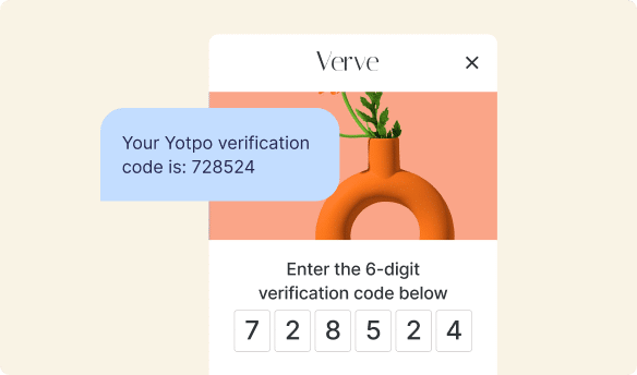
6. Social Proof
Imagine you’re thinking about buying a new toy. Would you rather buy it if many friends told you it was super fun, or if no one said anything about it? Most likely, you’d go with the toy your friends liked! That’s exactly how social proof works on a landing page. It’s like having many people tell you something is great. This can include customer reviews, star ratings, testimonials (short quotes from happy customers), or even how many people have already bought something. Businesses use tools like Yotpo Reviews to easily gather these stories and star ratings from their real customers. Then, they can show them right on their landing pages. When visitors see these authentic reviews, they feel more confident and are more likely to take the next step, whether that’s signing up for a newsletter or making a purchase. It’s a powerful way to build trust quickly and shows that others have had a positive experience. You can see how Yotpo Reviews helps businesses make their products shine with real customer voices.
7. Forms (If You Need Information)
If the landing page’s goal is to collect information, then a form is essential. This is where you’d type your name, email, or other details. Good forms are usually short and only ask for the most important information. No one likes filling out a super long form! They should be easy to understand and quick to complete.
When all these parts work together smoothly, a landing page becomes a powerful tool that guides visitors, builds trust, and helps businesses achieve their marketing goals effectively.
Types of Landing Pages
Just like there are different kinds of tools for different jobs, there are different types of landing pages, each designed for a specific purpose. Knowing the difference can help you understand why you might see a certain kind of page after clicking an ad or a link.
1. Lead Generation Pages
These are probably the most common type. Their main goal is to collect information about potential customers, also known as “leads.” Think of it as a business trying to find people who might be interested in what they offer. These pages usually feature a form where you can enter your email, name, or other details in exchange for something valuable, like a free ebook, a webinar registration, a trial of software, or a special discount. The business then uses this information to follow up with you later, offering more of what you might like.
Example: “Download Our Free Guide to Healthy Eating” with a form asking for your name and email.
2. Click-Through Pages
Unlike lead generation pages, click-through pages don’t usually have a form. Instead, their job is to get you excited about an offer and then send you to another page to complete the action. They act as a bridge, giving you just enough information to make you want to click one more time. These are often used for e-commerce stores that want to direct you to a product page or a sales page. The page builds desire and anticipation, then pushes you to the final destination.
Example: “See Our New Spring Collection – Shop Now!” which then takes you to the online store’s category page.
3. Squeeze Pages
Squeeze pages are a special kind of lead generation page that is super short and asks for very little information, usually just an email address. They are designed to “squeeze” out that one piece of information quickly. They often have a very clear, bold headline and a simple form, sometimes with no other navigation to distract you. Their goal is speed and simplicity to capture interest right away.
Example: “Enter your email to get secret discounts!” with just an email field and a submit button.
4. Sales Pages
Sales pages are designed to do one thing: sell a product or service directly. These pages are usually longer and more detailed, providing all the information a customer needs to make a buying decision. They often include extensive descriptions, testimonials, detailed benefits, pricing information, and a clear “Buy Now” button. They aim to convince you to open your wallet right there and then.
Example: A page with a detailed explanation of a new online course, its curriculum, instructor bios, student success stories, and a prominent “Enroll Now” button.
Each type of landing page plays a unique role in a business’s online strategy, guiding customers through different stages of their journey, from learning about something new to making a purchase or joining a community.
How Do Landing Pages Help Businesses Grow?
Landing pages aren’t just pretty web pages; they are powerful tools that help businesses grow in many important ways. Think of them as dedicated sales assistants that work 24/7, making sure every visitor gets the right message and knows what to do next. Here’s how they contribute to business growth:
1. Turning Visitors into Customers (Conversions)
This is perhaps the biggest way landing pages help. When a visitor completes the desired action – like making a purchase, signing up for an email list, or filling out a form – that’s called a “conversion.” Because landing pages are so focused and remove distractions, they are much better at converting visitors into customers or leads than a regular website page. This means more sales, more sign-ups, and ultimately, more success for the business. Understanding and improving your eCommerce conversion rate is crucial, and landing pages are a key component.
2. Gathering Valuable Customer Information
When people fill out forms on landing pages, businesses collect important information. This data helps them understand who their customers are, what they like, and how to serve them better. For example, knowing someone is interested in dog toys helps a pet store send them specific offers for dog toys, rather than cat food. This smart use of information makes marketing much more effective.
3. Improving Marketing Efforts
Landing pages make it easier for businesses to test different marketing ideas. They can create two slightly different landing pages for the same product and see which one performs better. This helps them learn what headlines, pictures, or calls to action work best for their audience, making their future advertising and marketing even stronger. It’s like a scientist experimenting to find the best formula!
4. Building Stronger Customer Relationships and Loyalty
Once someone visits your landing page and perhaps buys something or signs up, you want them to come back, right? This is where customer loyalty programs shine. A landing page can be a fantastic way to introduce people to a brand’s loyalty program, explaining how they can earn points for shopping, sharing, or referring friends. Businesses use amazing programs like Yotpo Loyalty to create fun and rewarding experiences for their customers. These programs help customers feel special and encourage them to keep coming back, turning one-time visitors into long-term fans. A great loyalty program can make all the difference in keeping customers happy and engaged. Learning how to improve customer retention is vital, and loyalty programs are a cornerstone of that strategy. You can also explore Yotpo Loyalty to see how they help businesses build these strong relationships.
In essence, landing pages are not just isolated web pages; they are critical pieces of a larger marketing puzzle, meticulously designed to attract, engage, and convert visitors into loyal customers, helping businesses thrive and expand their reach.
The Magic of Social Proof on Landing Pages
Have you ever tried a new restaurant because your friend said it was amazing? Or bought a movie ticket because it had great reviews? That’s social proof at work! It’s the idea that people are more likely to trust and follow the actions of others. On a landing page, social proof is incredibly powerful because it helps build trust very quickly, even if a visitor has never heard of the business before.
What is Social Proof?
Social proof comes in many forms, but on a landing page, you’ll usually see it as:
- Customer Reviews: Real stories and opinions from people who have used the product or service.
- Star Ratings: The familiar 1 to 5-star ratings that give a quick summary of satisfaction.
- Testimonials: Short, positive quotes from happy customers.
- User-Generated Content (UGC): Photos or videos created by customers showing them using the product. This is super authentic! You can explore more about what user-generated content is and its impact.
- “As Seen On” Logos: Logos of well-known publications or media outlets that have featured the brand.
How Yotpo Reviews Makes Landing Pages Shine
Imagine a landing page for a new type of healthy snack. If the page just talks about how good the snack is, you might be curious. But what if it also shows photos of real people enjoying the snack, alongside their glowing reviews and a 4.8-star rating? Suddenly, that snack seems much more trustworthy and appealing!
This is where Yotpo Reviews comes in. Yotpo provides businesses with an amazing tool to easily collect, manage, and display customer reviews, ratings, photos, and videos. Businesses can then seamlessly integrate these powerful pieces of social proof directly onto their landing pages. When a potential customer visits a landing page and sees honest feedback from others, they feel a stronger sense of confidence and less doubt. It helps them feel that they are making a safe and good choice.
By showing off what real customers think, a landing page becomes more persuasive and effective. It helps visitors move closer to making a purchase or signing up because they see that others have already had a positive experience. This kind of authentic feedback is incredibly valuable for building trust and encouraging action. It’s a bit like getting a personal recommendation from a friend, but on a much larger scale!
Building Customer Loyalty with Landing Pages
Getting a new customer is great, but keeping them coming back is even better! Loyal customers often spend more over time and even tell their friends about you. Landing pages can play a clever role in starting and strengthening this loyalty journey. They aren’t just for getting that first click or sign-up; they can also be a gateway to long-term relationships.
How Landing Pages Help with Loyalty
Think about these scenarios:
- Introducing Loyalty Programs: A landing page can be specifically designed to promote a brand’s loyalty program. It can clearly explain how customers earn points (e.g., for every purchase, for signing up, for leaving reviews) and what exciting rewards they can get (discounts, exclusive products, early access to sales). This makes the program sound inviting and easy to understand.
- Exclusive Offers for Loyal Customers: Businesses might create special landing pages just for their existing loyal customers, offering them unique discounts or early access to new products. This makes loyal customers feel valued and appreciated.
- Encouraging Repeat Purchases: After a first purchase, a thank-you landing page could invite customers to join the loyalty program or offer a small discount on their next order, nudging them to return.
How Yotpo Loyalty Makes Customers Come Back
So, how do businesses make these loyalty programs actually work and feel special? That’s where Yotpo Loyalty steps in. Yotpo Loyalty provides businesses with amazing software to create, manage, and grow their own custom loyalty and rewards programs. It’s not just about points; it’s about creating an experience where customers feel recognized and rewarded for being part of the brand’s community. This can involve:
- Earn & Redeem Points: Customers earn points for various actions and can easily redeem them for exciting rewards directly within the online store.
- VIP Tiers: Rewarding customers with special perks as they spend more, making them feel like an exclusive member of the club.
- Referral Programs: Encouraging loyal customers to tell their friends about the brand in exchange for rewards, helping the business grow with trusted recommendations. You can read more about what a referral code is.
When a business uses Yotpo Loyalty, they can design a program that truly fits their brand and delights their customers. A landing page can then act as the perfect front door to this program, clearly explaining its benefits and making it simple for customers to join. This synergy helps turn one-time shoppers into repeat buyers and passionate advocates, which is a fantastic way for any business to thrive.
By offering clear pathways to loyalty programs through well-designed landing pages, businesses build lasting relationships, increase customer lifetime value, and cultivate a community of enthusiastic brand supporters. Find out more about how Yotpo Loyalty helps create these powerful connections.
Tips for Making Your Landing Page Awesome
Creating a great landing page isn’t just about having all the right parts; it’s also about making them work together in the best possible way. Here are some simple tips to help any landing page become a superstar:
1. Keep It Simple and Clean
Think “less is more.” A crowded landing page with too much text, too many pictures, or too many choices can be confusing. Keep the design clean and easy on the eyes. Focus on one main message and one clear action you want people to take. Remove anything that doesn’t help with that main goal. This helps visitors understand quickly and reduces the chance they’ll get distracted and leave.
2. Make It Super Fast
No one likes waiting for a slow website! If your landing page takes too long to load, people will click away before they even see what you’re offering. Make sure your images are optimized (not too big), and the page’s code is clean so it loads quickly. Speed is key to keeping visitors engaged.
3. Test Different Ideas
Even the best designers can’t always guess what will work best. That’s why testing is so important! Try different headlines, different pictures, or different colors for your “Call to Action” button. Show half your visitors one version and the other half a different version, then see which one gets more people to take action. This is called A/B testing, and it’s how businesses learn what their audience truly likes. It helps improve your eCommerce conversion rate over time.
4. Match It to Your Ads
If someone clicks on an ad that promises “50% off Summer Clothes,” the landing page they land on better be about “50% off Summer Clothes”! The message on the ad should perfectly match the message on the landing page. If there’s a disconnect, people will get confused or feel tricked, and they’ll leave. Consistency builds trust and makes the visitor feel like they’re in the right place.
5. Design for Mobile Phones First
Lots of people browse the internet on their phones or tablets. Your landing page needs to look great and be easy to use on small screens. Buttons should be easy to tap, and text should be readable without zooming in. This is called “responsive design,” and it’s super important today because many people will see your page on a mobile device.
6. Include a Clear Privacy Policy or Trust Badges
When you ask for personal information, people want to know their data is safe. A small link to a privacy policy or showing trust badges (like “secure payment” icons) can make visitors feel more comfortable sharing their details. It builds trust and professionalism.
By following these tips, businesses can create landing pages that are not only attractive but also highly effective at achieving their goals and connecting with their audience.
Common Mistakes to Avoid
Even with the best intentions, it’s easy to make mistakes when creating landing pages. Avoiding these common pitfalls can save businesses time and help them get better results. Here are some things to watch out for:
| Mistake | Why It’s a Problem | How to Fix It |
|---|---|---|
| Too Much Text | People often skim web pages. If there’s a huge block of text, they might get overwhelmed and leave without reading your important message. | Use short paragraphs, bullet points, and bold important words. Get straight to the point! |
| No Clear Call to Action (CTA) | If visitors don’t know what they’re supposed to do next, they won’t do anything. A hidden or vague CTA is a missed opportunity. | Make your CTA button stand out with a contrasting color and clear action words like “Get Your Free Guide” or “Shop Now.” |
| Slow Loading Speed | In today’s fast-paced world, people expect pages to load instantly. If it takes more than a few seconds, they’re gone. | Optimize images, use efficient code, and choose a reliable hosting service. Test your page speed regularly. |
| Too Many Distractions | Extra navigation menus, pop-ups that appear too soon, or too many offers can pull visitors away from the main goal. | Keep your landing page focused. Remove unnecessary links and only include elements that support your single main objective. |
| Not Mobile-Friendly | If your page looks messy or is hard to use on a phone, you’ll lose a huge number of potential customers. | Always design with mobile devices in mind. Test your page on different phones and tablets to ensure it looks and works great everywhere. |
| Unclear Messaging | If your headline or offer is confusing, visitors won’t understand what you’re trying to tell them and will quickly leave. | Use simple, direct language. Make your value proposition and CTA crystal clear. Ask a friend to read it and tell you if they understand it easily. |
By being aware of these common slip-ups and working to avoid them, businesses can create landing pages that are much more effective at engaging visitors and achieving their marketing and sales goals.
Conclusion
So, there you have it! A landing page isn’t just another page on a website; it’s a specially designed, focused tool with one clear mission: to get visitors to take a specific action. Whether it’s to sign up for a newsletter, download a free guide, or make a purchase, a great landing page cuts through the noise and guides you directly towards the goal. We’ve seen how these pages differ from regular website pages, why businesses rely on them for growth, and the key ingredients that make them powerful, like a strong headline, clear call to action, and the magic of social proof. Tools like Yotpo Reviews and Yotpo Loyalty play a big part in making these pages even more effective by building trust and encouraging long-term customer relationships. By keeping things simple, fast, and mobile-friendly, and by carefully avoiding common mistakes, businesses can create landing pages that truly shine, turning curious visitors into happy customers and loyal fans. It’s a smart way to grow and connect with people in the busy online world.


 Join a free demo, personalized to fit your needs