


What is Dark Mode (Email)? The Digital Comfort Zone for Your Eyes
Have you ever looked at your phone or computer screen late at night and felt like it was super bright? Like a flashlight shining right in your face? Many people have, and that’s why something called “Dark Mode” became a big deal! It’s like flipping a switch to make your screen easier on your eyes. When we talk about Dark Mode for emails, it means that the messages you get in your inbox can also change their look to fit this darker style.
For brands and businesses, understanding Dark Mode is super important. They want to make sure the emails they send you look great, no matter how you prefer to read them. A good customer experience often starts with the small things, like how easy it is to read an email. And that’s where thinking about Dark Mode comes into play. It helps ensure your favorite brands always look their best, keeping you happy and engaged.
Getting Cozy with Dark Mode: What Exactly Is It?
Think about a classic blackboard in a classroom. It has a dark background and light writing, right? Dark mode is pretty much the digital version of that! Instead of seeing black text on a bright white screen, you see light-colored text (like white or light gray) on a dark background (like black or dark gray). It’s a simple idea that makes a big difference.
Most phones, computers, and even many apps let you turn on Dark Mode. It’s usually a setting you can find in your phone’s display options or within the app itself. When you switch it on, almost everything on your screen changes to that dark theme, giving your eyes a break from all that bright light.
Why Do People Love Dark Mode So Much?
There are a few main reasons why so many folks are choosing the dark side (in a good way!):
- Less Eye Strain: Bright screens, especially in dim rooms, can make your eyes feel tired and uncomfortable. Dark mode can reduce that glare, making reading feel smoother.
- Better Sleep: Some studies suggest that too much bright light from screens before bed can make it harder to fall asleep. Dark mode helps lower the amount of bright light you’re exposed to.
- Saving Battery Life: On devices with OLED screens (many newer phones have these), black pixels are actually turned off, meaning they use less power. So, dark mode can help your battery last longer!
- It Looks Cool: Let’s be honest, for many, dark mode just looks sleek and modern. It gives apps and websites a fresh, stylish feel.
Because so many people enjoy using dark mode for their daily browsing and app usage, it’s only natural that they expect their emails to look good in this setting too. Brands that pay attention to these details are often the ones that build stronger connections with their customers, creating a better customer experience overall.
Dark Mode and Your Emails: A Big Deal for Brands
Now, let’s talk about emails. When you open an email in an email app that has dark mode turned on, something interesting happens. The email might automatically try to match the dark theme of your app. This means text colors could flip, and background colors could change. What was once a light-colored email can suddenly become dark.
Why does this matter so much for businesses that send out newsletters, special offers, or updates? Imagine a brand spends a lot of time designing a beautiful email with their specific colors and logos. If that email looks completely different, or even broken, in dark mode, it can be a little disappointing for the person reading it. It’s like expecting a vibrant rainbow and seeing just shades of grey.
For a brand, keeping customers happy and engaged is the name of the game. If an email is hard to read or looks messy because of dark mode, people might just delete it without even checking out what’s inside. This means missed opportunities for sharing important news, exciting products, or even a fun new loyalty program.
How Dark Mode Can Change Your Emails
When an email client (like Gmail, Outlook, or Apple Mail) switches to dark mode, it often tries to “invert” the colors of your email. This isn’t always perfect, and different email clients do it in different ways. Here’s what often happens:
- Background Colors: A white background might turn black or dark gray.
- Text Colors: Dark text (like black) might turn white or light gray so you can still read it.
- Images: This is where it gets tricky! Some images, especially those with logos or text that assume a light background, might look strange or have a weird halo effect.
- Branding: A brand’s specific colors, which are carefully chosen, can sometimes be changed, making the email look less like the brand.
Let’s look at a simple example:
| Element | Looks in Light Mode | Might Look in Dark Mode |
|---|---|---|
| Email Background | Bright White | Dark Gray or Black |
| Headline Text | Dark Blue | Light Blue or White |
| Button Text | White (on a red button) | Still White (on a red button) |
| Logo Image | Black logo on transparent background | Still black, might be hard to see on dark background |
See how the logo could become almost invisible? That’s a problem for a brand trying to make a good impression! That’s why brands really need to think about how their emails appear to everyone, including those who prefer dark mode.
Why Should Brands Care About Dark Mode in Emails?
It’s all about making customers happy and keeping them coming back. If your emails look good, people are more likely to read them, click on links, and ultimately engage with your brand. This leads to better sales and stronger customer relationships. It’s part of creating a fantastic eCommerce customer experience.
Happy Customers, Clear Messages
Imagine receiving an email with an amazing deal, but the text is hard to read because it’s dark gray on a black background. You’d probably get frustrated and just close it, right? Brands want their messages to be crystal clear. Whether it’s a special discount, news about a new product, or a friendly reminder, they need you to see it easily.
When customers have a smooth and enjoyable experience, they’re more likely to trust the brand and feel good about interacting with them. This positive feeling can even encourage them to leave positive reviews and recommend the brand to their friends and family. That’s a powerful way to grow!
Looking Professional and Attentive
Paying attention to details like dark mode shows that a brand cares about its customers’ preferences and goes the extra mile. It signals professionalism and thoughtfulness. In today’s busy world, where everyone gets tons of emails, standing out for being considerate can make a big difference. It’s one of the ways to improve customer retention – making them feel valued.
A poorly displayed email can make a brand seem careless or outdated. On the other hand, an email that looks great in any mode feels polished and modern. This consistent, positive image helps build trust and strengthens the bond between a customer and their favorite brands. And that trust often translates into more purchases and greater loyalty over time.
Tips for Making Your Emails Look Great in Dark Mode
So, how do brands make sure their emails are always looking their best, no matter if you’re using light or dark mode? It takes a bit of planning and some smart design choices. Think of it like dressing up for different weather conditions – you need to be prepared!
1. Use Transparent Images, Especially for Logos
This is a big one! If your brand logo is a dark color on a white square background, it will look like a weird white box when the email switches to dark mode. Instead, brands should use logos and other graphics with a transparent background. This way, the background of the image will simply blend with the new dark background of the email, keeping everything looking neat.
It’s like having a sticker that only shows the design, not the paper it’s printed on. This attention to visual detail enhances the overall eCommerce customer experience.
2. Test, Test, and Test Again!
The best way to know if an email looks good in dark mode is to actually send test emails to different email apps (like Gmail, Outlook, Apple Mail) and check them with dark mode turned on. Since different email clients handle dark mode a bit differently, what looks perfect in one might be a little off in another. Brands often have special tools to help them test their emails across many platforms quickly.
Think of it as trying on clothes in different mirrors to make sure they look good from all angles. This thorough testing helps ensure a consistent brand image and clear communication, which can lead to higher eCommerce conversion rates.
3. Think About Your Colors and Contrast
When designing an email, brands should think about colors that will look good in both light and dark settings. Sometimes, a color that looks great on white might disappear or clash on black. It’s important to have enough contrast so that text is always easy to read. For example, using a slightly lighter shade of black for text might be better than pure black, which could be completely invisible against a dark background.
Here’s a quick idea:
- Avoid: Pure black text on a white background (can become pure black on a dark background).
- Try: Dark gray text on a white background (can easily convert to light gray on a dark background).
- Always Ensure: Good contrast between text and background.
4. Simple Designs Often Work Best
Emails with very complex layouts, lots of tiny details, or fancy background images can sometimes get messed up when dark mode tries to change them. Keeping the design clean, simple, and straightforward can actually make emails more robust and less likely to break in different viewing environments. It’s like building a sturdy house – a simpler design can sometimes be stronger.
5. Consider “Dark Mode Only” Styles (For the Tech-Savvy)
For brands that really want to go the extra mile, there are ways to add special code to an email that tells it exactly how to look when dark mode is turned on, without affecting how it looks in light mode. This is a bit more advanced, but it allows for precise control over colors, images, and other design elements specifically for dark mode users. It’s like having a secret instruction manual just for dark mode!
The Role of Customer Feedback in Email Design
Thinking about dark mode for emails is a perfect example of listening to your customers. When people choose to use dark mode, they’re telling you they prefer a certain kind of visual experience. Brands that pay attention to these preferences and adjust their email designs show that they care about their customers’ comfort and satisfaction.
How do brands know what customers like? They ask! And they pay attention to feedback. Gathering user-generated content, like product reviews and ratings, gives businesses amazing insights into what their customers love and what could be better. This feedback isn’t just about products; it’s about the entire experience, from how easy a website is to use to how enjoyable an email is to read.
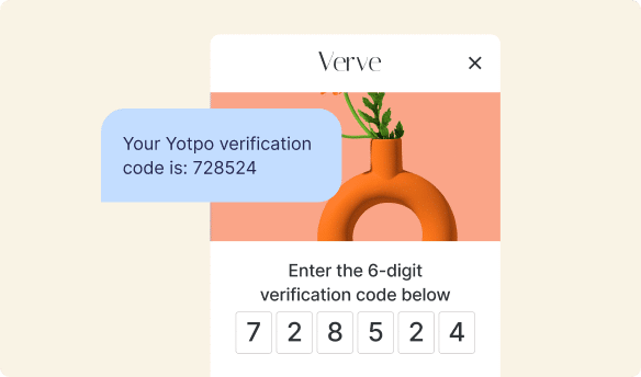
For example, if a brand starts getting comments or seeing lower engagement on emails, they might realize their dark mode optimization isn’t quite right. Tools like Yotpo Reviews help brands collect and understand what their customers are saying. When brands truly understand their customers’ needs, they can make smarter decisions about everything, including how to design emails that connect with people better. This feedback loop is essential for improving the consumer decision-making process by building trust and relevance.
Building Customer Loyalty Through Thoughtful Design
When a brand consistently delivers a good experience – whether it’s through amazing products, helpful customer service, or perfectly designed emails that work in dark mode – customers notice. These positive interactions build trust and make people feel valued. And when customers feel valued, they’re much more likely to stick around, become repeat buyers, and even become brand advocates, spreading word-of-mouth marketing.
Every tiny detail, like ensuring an email looks sharp in dark mode, contributes to the overall feeling a customer has about a brand. It’s not just about one email; it’s about a continuous journey. Brands want to create an experience where customers feel so good that they don’t want to shop anywhere else. That’s the power of customer loyalty.
By using smart strategies and paying attention to details like dark mode, brands can show they truly care. This dedication helps foster a community of loyal customers who feel connected to the brand. Creating a top-notch loyalty program with Yotpo Loyalty can further strengthen these bonds, rewarding customers for their continued support and engagement across all touchpoints, including beautifully designed emails.
Common Questions About Dark Mode Emails
It’s natural to have questions about something new or technical like dark mode. Let’s clear up some common thoughts people have!
Does Everyone Use Dark Mode?
No, not everyone! While dark mode is very popular and growing, many people still prefer the traditional light mode. That’s why it’s so important for brands to design emails that look great in both settings. You can’t assume everyone is using dark mode, just like you can’t assume everyone is using light mode. The goal is to make sure the email experience is excellent for everyone, no matter their preference.
Is It Hard to Make Emails Dark Mode Friendly?
It can be a bit tricky! It requires some extra thought during the design process and careful testing. It’s not as simple as just “flipping a switch” on the brand’s end. Brands need to be mindful of their color choices, image types, and how different email clients might interpret their code. However, with the right tools and a good design team, it’s definitely something that can be achieved to create beautiful and accessible emails.
What If a Brand Doesn’t Optimize for Dark Mode?
If a brand doesn’t think about dark mode when designing emails, their messages might end up looking a bit off or even broken for people who use dark mode. This could mean:
- Unreadable Text: Dark text on a dark background.
- Invisible Images: A dark logo on a dark background.
- Clashing Colors: Colors that looked good in light mode might look strange or out of place in dark mode.
- Poor Branding: The email might not look like the brand’s usual polished style.
All these issues can lead to a bad customer experience. When an email looks bad, customers are less likely to read it, which means they might miss out on important information or special offers. This can hurt engagement and ultimately impact how much a customer feels connected to a brand.
Bringing It All Together: Why Good Email Design Matters for Your Brand
In the digital world we live in, every interaction a customer has with a brand counts. From browsing a website to receiving a special offer in their inbox, each moment shapes their opinion and experience. Dark mode for emails might seem like a small detail, but it’s actually a really important part of making sure that experience is as good as it can be for everyone.
When brands take the time to design emails that look fantastic, whether you prefer bright screens or comfortable dark ones, they are showing that they care about their customers’ preferences and comfort. This thoughtfulness doesn’t just make emails easier to read; it builds trust, strengthens brand image, and encourages deeper engagement.
A positive email experience is one piece of a much larger puzzle: creating a truly amazing customer journey. When customers feel understood and valued, they’re more likely to share their positive experiences, influencing others through word-of-mouth marketing and creating a thriving community around the brand. They become loyal fans who keep coming back.
Ultimately, by paying attention to details like dark mode optimization, brands ensure their messages are always seen, understood, and appreciated. This commitment to customer satisfaction aligns perfectly with tools like Yotpo Reviews and Yotpo Loyalty, which empower businesses to build strong, lasting relationships with their customers by listening to their feedback and rewarding their engagement. It’s all about making every step of the customer journey, including opening an email, a delightful one.


 Join a free demo, personalized to fit your needs